Agro Ocean, an edible oil brand, faced the challenge of breaking into a highly competitive and crowded kitchen essentials market. Their existing look didn't communicate the purity or the premium quality of their products. In the food industry, if your brand doesn't look "healthy" and "trustworthy" at a glance, consumers will simply reach for a familiar competitor on the shelf.
Our Study
The Psychology of Purity and Health
We researched the buying habits of health-conscious households. We found that consumers look for visual cues of "nature," "cleanliness," and "reliability."
We studied the competitive landscape of edible oils to ensure that Agro Ocean’s new identity would not only look modern but would also immediately signal
high-quality standards to both retail shoppers and bulk distributors.
The Solution: A Fresh, Modern Brand Ecosystem
OUR APPROACH
We engineered a complete visual and digital transformation to position Agro Ocean as a leading choice for healthy cooking.
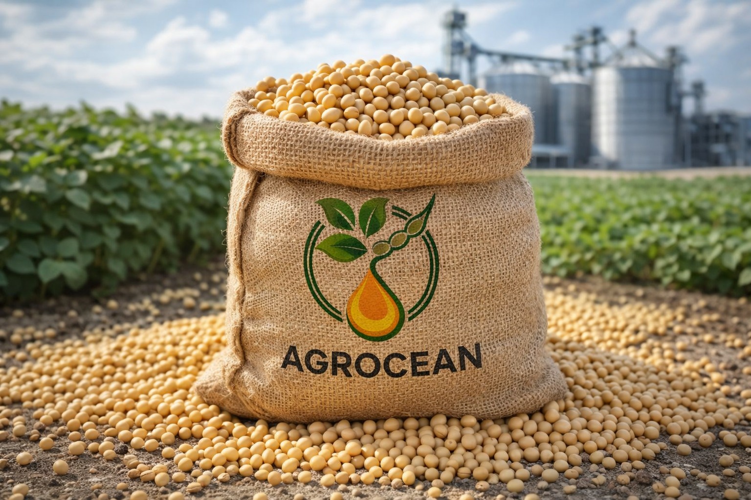
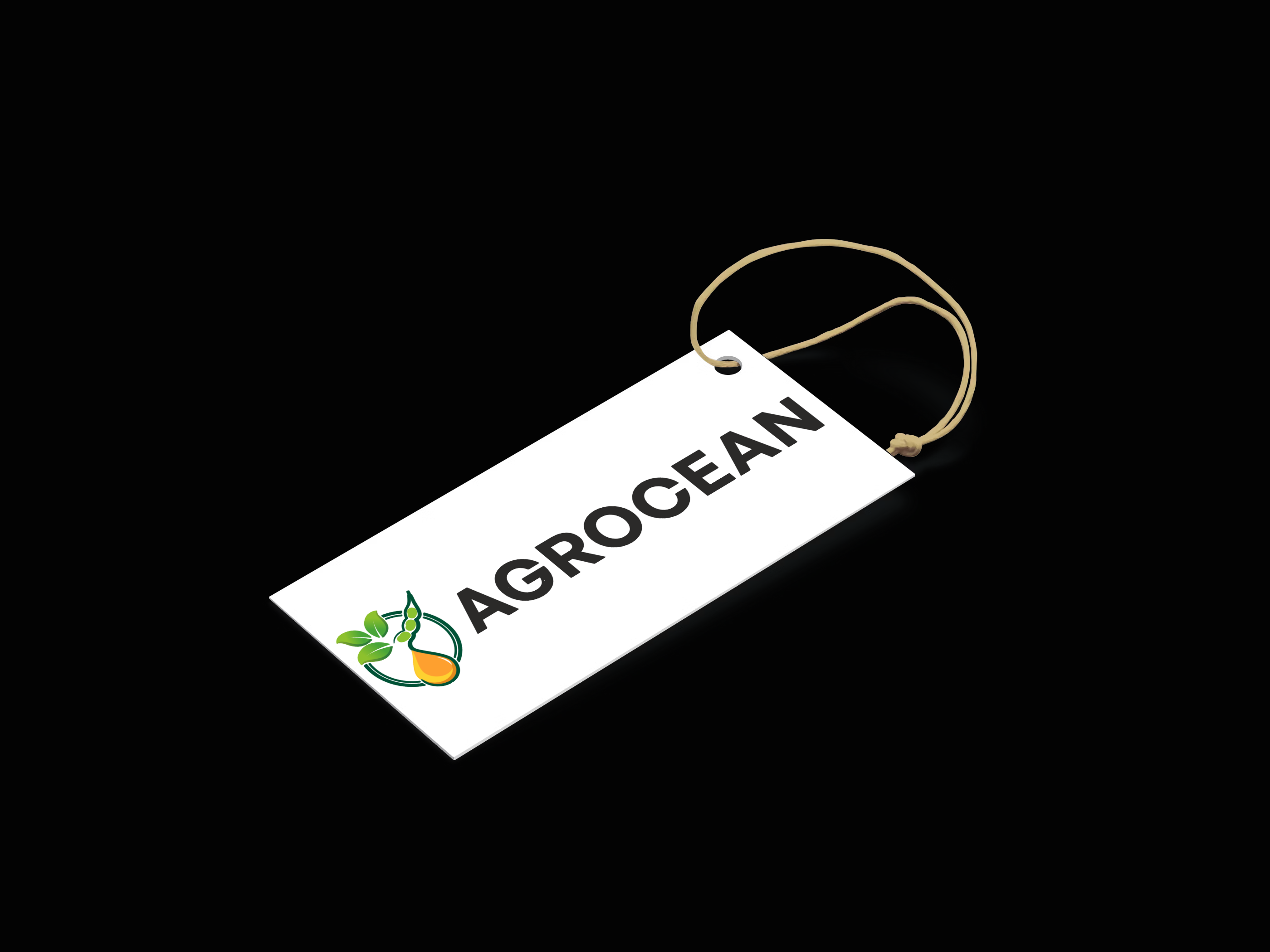
Authoritative Logo Design: We created a distinctive visual identity that balances the "ocean" of abundance with the "agro" roots of the product, ensuring the brand entity is memorable and professional.
Premium Brand Identity: We developed a cohesive color palette and design language that reflects purity and health, making the brand feel like a premium staple in any kitchen.
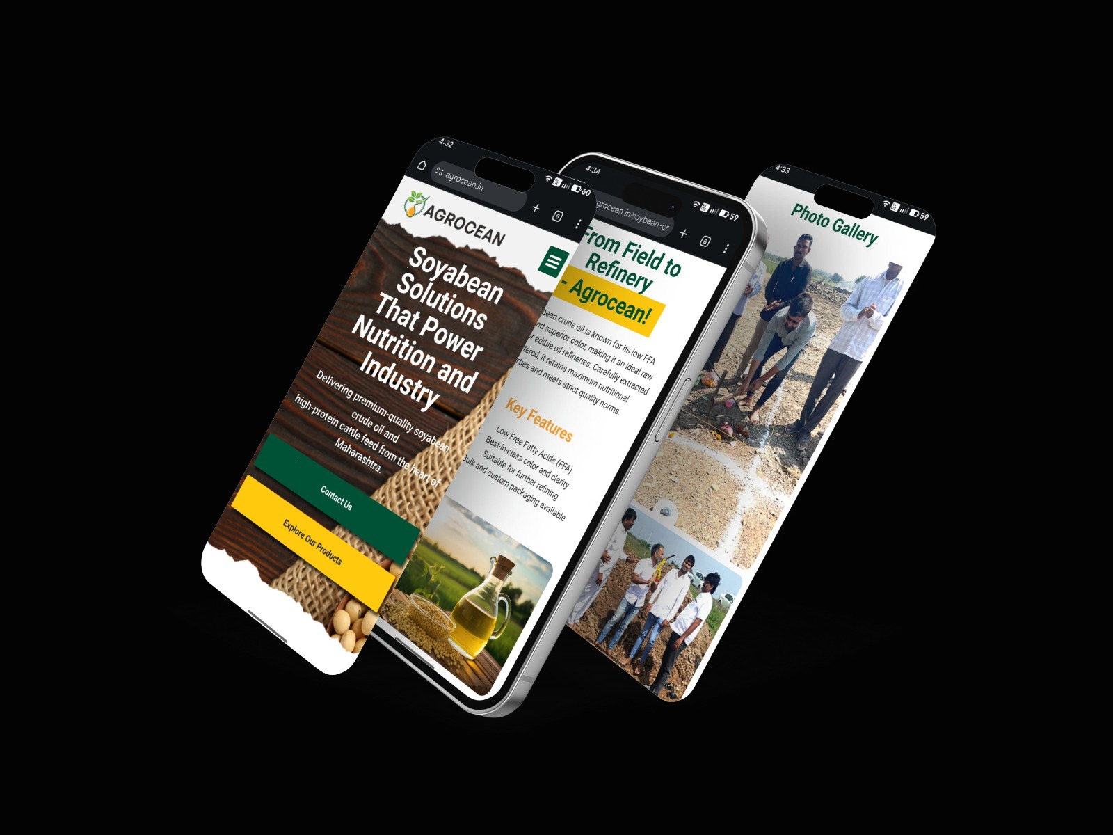
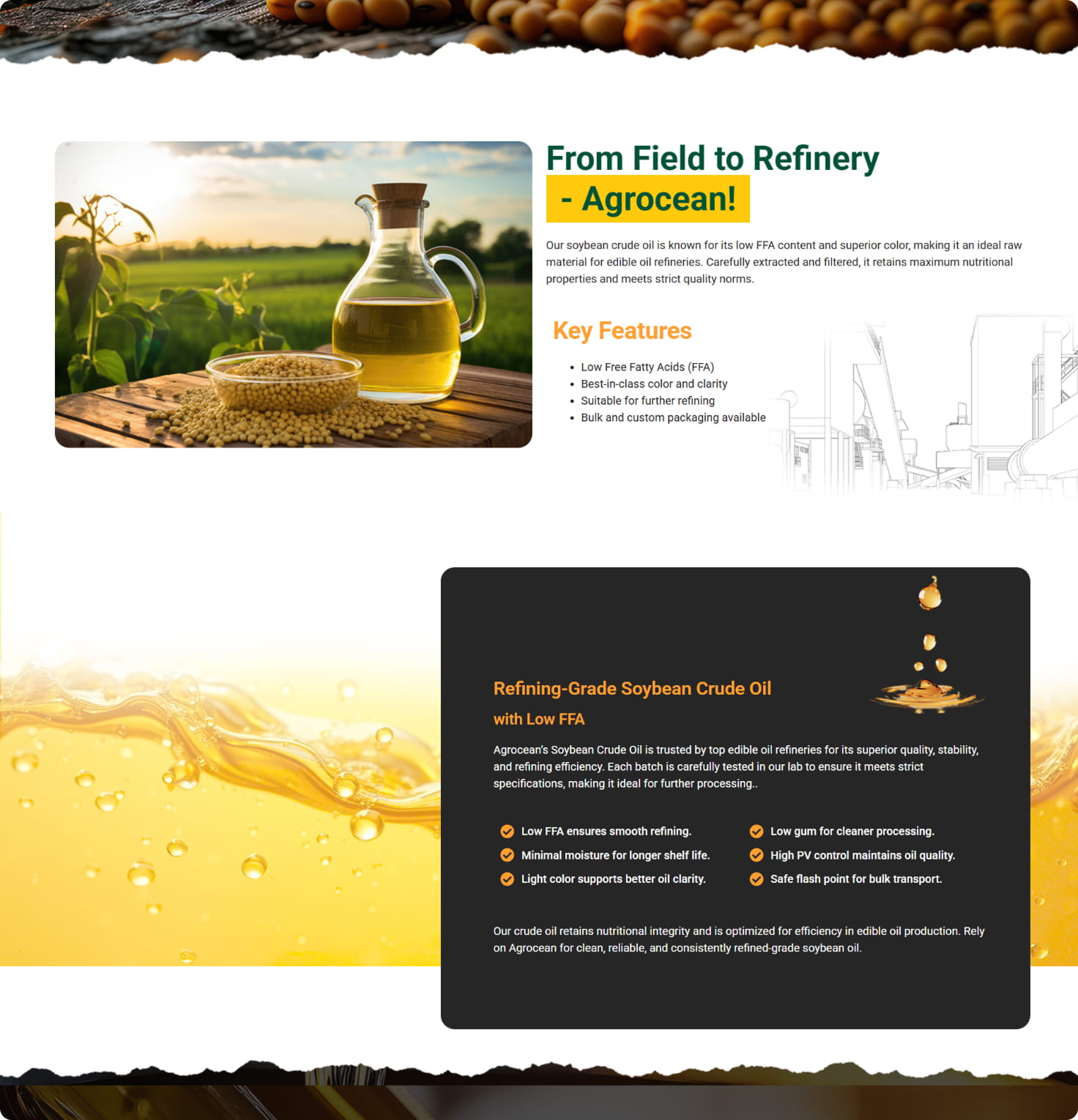
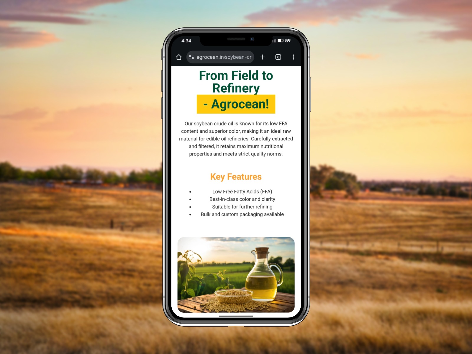
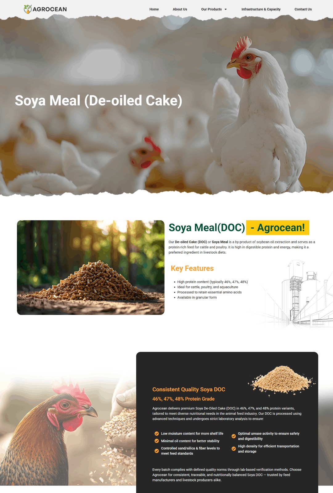
High-Performance Website: We built a fast, clean, and mobile-responsive website that serves as the brand’s digital headquarters. It was designed to clearly showcase product benefits and build instant trust with every visitor.
Built for Discovery: The website was structured to be easily "read" by search engines and AI models, ensuring that when users look for quality edible oils, Agro Ocean is presented as a credible and authoritative source
THE RESULTS
AgrOcean now competes with a brand presence that looks and feels premium across every surface from jute sack labels to digital screens. The unified identity builds instant consumer trust on the shelf, while the SEO-optimized website ensures the brand is discoverable by both retail shoppers and bulk distributors searching online.